Sunday, June 01, 2008

How to Photograph Artwork

How to Photograph Artwork, How to Photograph Art, Photographing Artwork, Photographing Art Hello.

The following tutorial is a relatively quick and simple how-to for photographing 2-D artwork such as paintings, textiles, glass-covered images, reproducing newsprint, and more. I will also cover how to correct and post process the photographed artwork.

I have found the easiest and most controllable way to photograph artwork is to use strobes or off-camera flash. If you are unfamiliar with off-camera lighting in general, I highly recommend you spend (a lot) of time reading and exploring www.strobist.com.

Let's go over some basic gear needed to shoot artwork:
  • A good lens, with no distortion or vignetting (see lens reviews at Photozone). Macro lenses are an obvious choice.
  • Strobes or off-camera flashes, preferable with a PC-Synch port.
  • Flash transmitters or receivers such as optical slaves, Cactus V2s, Pocket Wizards, or Nikon's CLS system. You can also use flash cords.
  • Light stands that can go to the full height of the work you are photographing.
  • Tripod to keep your camera steady, and to help keep the camera square to the artwork.
  • Grey card (not essential, but will simplify the entire process).
  • Camera! (Digital is preferred, so you can preview your work.)

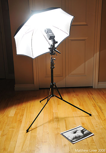
  • For photographing wall-hung artwork, I have found that using two flashes, each on a lightstand and each reflected into an umbrella, the best setup. One light goes on each side of the artwork, at the same height as the artwork and at 45° to the artwork. Below is a setup image of a hooked rug I photographed recently. I've increased the contrast so you can more easily see how the light is falling on the art.


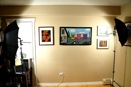
    As you can see, the light is falling evenly on the hooked rug in the image as the overlapping fading lights balance out. Closer to the lights, however, the light falling on the wall is too strong, and if the artwork was within that range, it would result in bright spots at the edges.

    How to set up your lights and your camera:
  • Set your camera's ISO to its lowest native setting (this will ensure optimal image quality).
  • Set your camera's highest synchable shutter speed (you'll want to eliminate as much ambient light as possible).
  • Set your camera's white balance manually (see paragraph below), or to cloudy, as that generally creates pleasing colours with flash.
  • Set your aperture to between f/5.6 and f/11 - you'll want good depth of field and sharpness, but have some flexibility for controlling the light getting to the sensor.
  • Set all your flash triggers so they are all on the same channel.
  • Start with your flashes at 1/2 power. Do some test shots, watch your camera's LCD and histogram, and vary your flash power and aperture to get the light level right. Try not to bring your flash power up to full (1/1) power, as this will eat through batteries faster, and cause slower recycling times.
  • Point your flashes into their respective umbrellas, and then the umbrellas at 45° angles toward the artwork. Start with the lights approximately 1 metre (3.23 feet) out from the wall, and 1 metre to each side of the artwork. Shift them around as needed.

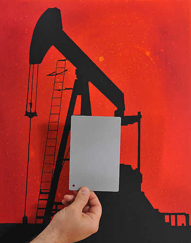
  • Once the lighting has been set up, the next step (not entirely necessary, but this will make post processing far easier) is to take a white balance reading from a grey card. The easiest way is to take a manual white balance reading with your camera (check your manual for specific directions) while using the same lighting setup you'll use for photographing. Your other option is to shoot RAW, just photograph a grey card under the light being used, and use the grey card to set the white balance in post processing, with a program like Adobe Camera Raw (ACR). I personally find the first to be much easier.


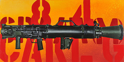
    Of the above-mentioned forms of artwork, I've found paintings to be the most difficult - oil on canvas in particular. That is because the reflective properties of the oil paint combined with the minute 3-D texture of the canvas make eliminating reflections very difficult. There is much you can do in post processing to tone down or eliminate these mini reflections or bright spots, but if you can get the shot right at the outset, your processes will be much faster and easier.

    The image below is of a painting by Edmonton, Alberta painter Melissa Ryan that I photographed (for reproduction purposes) last week.


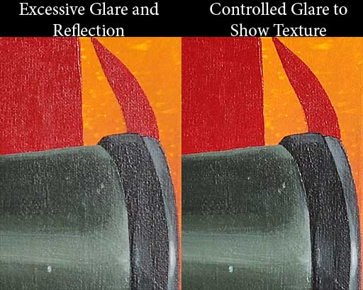
    This particular piece was difficult because of the size (over a metre [3.28 feet] wide). While I was comfortable with small amounts of glare on the painting (small amounts would be just enough to show the texture of the canvas and the oil paint, but excessive glare would destroy detail and change the brightness of the painting to something the painter had not intended), my initial shots showed too much glare, especially near the edges. Below is an example of the initial poor shot (left), and the shot with the corrected lighting (right).


    Much of getting lighting correct is trial-and-error (always double check your images on your camera's LCD), but there are some general rules that can be followed to avoid or easily correct your mistakes.

    In the initial setup shot, the lights were at 45° angles to the artwork. Theoretically, this should mean that the light would leave the artwork also at 45°. The issue is that when reflecting light into an umbrella, the light ends up striking the subject at multiple angles. In this case, that's everything from about 10° to about 80°. This means that some light ends up reflecting straight back into the camera lens, showing up as a reflection on the painting.


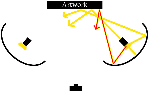
    As you can see in the sketch above, the stream of light drawn in red is streaming back toward the camera, and would show up as a bright reflection. To remedy this issue (if it occurs), reduce the angle between the light source and the wall (move the flash and umbrella closer to the wall) and keep the light source pointing straight at the artwork.


    Textiles and glassed-in images follow the same rules, but I've found them to be easier to photograph than oil paintings. With glassed-in images, you'll really want to make sure your shutter speed is as high as possible, as this will help eliminate any background reflections on the glass (including your own reflection). With this said, radio triggers are best for glassed-in work (such as Pocket Wizards or Cactus V2s), because you won't be using your on-camera flash to trigger the strobes, so there will be no light source on your camera that can reflect in the glass.


    This is a glassed-in photograph of the Eiffel Tower. Note that there is no glare or reflection in the glass.


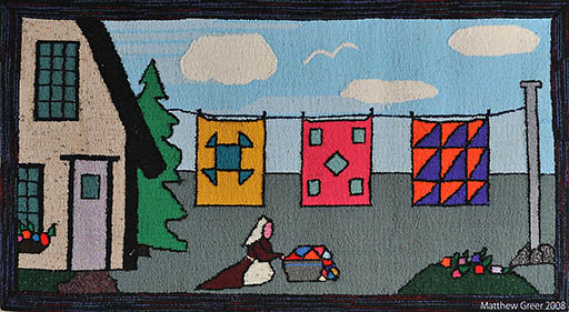
    This is a hooked rug, hooked with cotton and wool fibres. Glare and reflection aren't a significant issue with these materials, but even lighting is essential.


    Photographing Newsprint and Other Small Artwork


    For newsprint and other small, 2-dimensional artwork, a one-flash, one-umbrella setup works quickly and easily. Below is the setup, and shooting can easily be done with the artwork flat on the floor and shooting straight down on it.


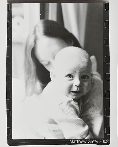
    As you can see, the light is very close to the artwork (in this case, a black and white 8x10 print on matte paper). There is just enough space for me to shoot down on the work without the umbrella getting in the way of the shot. There is no reflection and the light is even. Below is the resulting image.


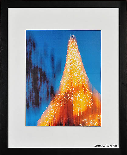
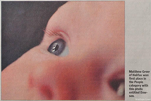
    And now below, is an image of a newspaper printed photo (of an image that I won a newspaper-based photo contest with).


    Post Processing Artwork


    Finally, we'll cover post processing artwork. There are a number of issues that have to be considered when professionally photographing artwork. First of all is perspective. When shooting artwork, every effort should be made to photograph the image perfectly square. It is not always possible to get it perfect, and with Photoshop, it is quite easy to correct perspective. I have already written an article on correcting perspective, covered here.

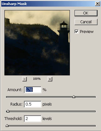
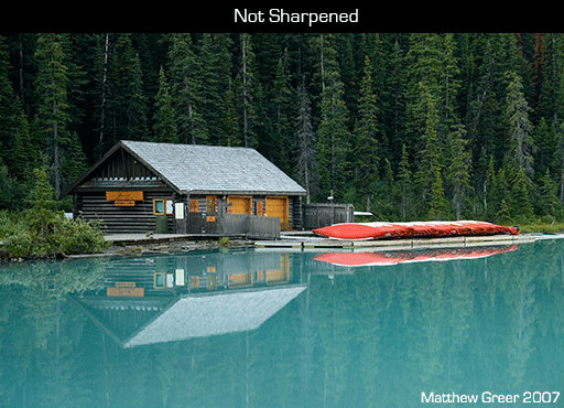
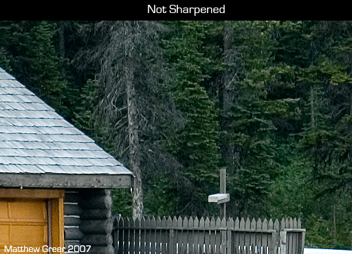
    Another aspect you'll want to control is sharpening. Again, I've covered that in a previous article, here.

    Finally, an issue we discussed earlier in the article is even lighting across the image. Every effort should be made to get this perfect while shooting, but not all lighting variations can be seen on a camera's LCD. If, after shooting artwork, you find that one side or corner of an image is lighter than it should be, it can be easily corrected in Photoshop.

  • With the image open in Photoshop, create a new layer (Layer > New > Layer... or Shift+Ctrl+N).
  • Change the Layer Blending Options (drop-down menu in the layers tab, Window > Layers or F7) to Soft Light.
  • Select the Brush Tool (B), choose a brush size that will be approximately half of the area you want to darken (use the [ and ] keys), and soften the brush edge all the way (use the Shift+[ keys).
  • Set the brush opacity to around 15% (simply pressing 1 + 5 on the top row of the keyboard will do this). A lower opacity and you won't see much change; a higher opacity and it will be difficult to blend the brightnesses together.
  • Paint the lighter area, one stroke at a time. If you need the area darker, click and paint again. If you need it lighter, Ctrl+Z to undo the change, reduce the opacity, and paint again.


  • If you have any questions or comments about this post, please Email me.

    Finally, a thanks to Melissa Ryan and her beautiful paintings, and Brian Larter for getting us in touch with each other.

    Matt

    Sunday, March 02, 2008

    Sharpening with Unsharp Mask (USM)

    Hello,

    After just finishing an article on the importance of image selection, I felt an article covering an essential method of making your images truly shine would be appropriate.

    This article is all about sharpening your images, for whatever purpose (either printing or web view). I will describe some example values to use for different images, cover how to sharpen for specific sizes, how to avoid sharpening halos, how sharpening can be used for haze removal, and finally, how it can sometimes help save an out of focus image.

    What is Sharpening? (And what is USM?)


    Sharpening refers to an increase in the contrast of edge definitions. Increasing sharpness helps bring out fine detail and can increase local contrast. It is important to note that it does not work in the same way as general contrast or curves adjustment.

    Simply, here's a quick example of an image before and after sharpening has been applied (I will get into the specifics of the values later):


    We've now covered what sharpening is. So what is Unsharp Mask (USM)? At first glance at the name, it seems contradictory to our goal. But, as we learned in the tutorial on masking, a mask hides elements of a process done to an image. In this case, the mask is hiding the 'unsharp' elements. Essentially, USM creates a somewhat blurred copy of the image being sharpened, then subtracts that copy from the original. In doing so, the USM is able to detect any edges in the image and then increase the contrast along those edges. It sounds complicated, but fortunately, programs that utilize USM do all this work themselves. Your work lies in understanding what setting you can adjust in the USM tool, and how to apply different settings to different images.

    Let's quickly go over some terms that are essential to understanding USM. Below is the window that will appear when you apply USM (the image in the window is mine - of course yours will be a crop of whatever image you are sharpening). You access this window in Photoshop through Filter > Sharpen > Unsharp Mask...


    There are three important fields in this window. They are:
  • Amount: This is shown in percent and is the degree of sharpening applied (which is then qualified by the next two variables).
  • Radius: This alters the edge size that is sharpened. A smaller radius alters smaller edges, and (hopefully obviously) a larger radius alters bigger edges.
  • Threshold: This tells the USM filter how different two tonal values have to be before USM affects them. For example, sharpening a tree and sky shot - you would want the branches sharpened but not noise in the sky. Typically, values between 0 and 5 are all you'll need to use (higher value means a greater difference in tonal values will need to exist before USM will affect them).

  • Finally, there are a few important notes before we get into specific sharpening techniques.
  • If you are working with multiple layers, make sure you have the base layer selected. If you sharpen a non-image layer, sharpening will do nothing (though you can use USM on layer masks if they have a blurred edge).
  • My preference is to duplicate the base layer, and apply USM to the new layer. That way I can alter the opacity, add a layer mask, or completely delete the sharpened layer later on.
  • It is best to apply sharpening as the very last step. Changes such as resizing, adjusting contrast, and other steps can affect what degree of sharpening needs to be applied to the final image.


  • Values for Different Detail Types


    Here are a couple of examples of USM values to use for different detail types. Now, these images are quite small, and so I used values specific to their size. More on that in the next section.

    Typically, fine detail requires a smaller radius with a greater amount, while coarse, blunt detail requires a larger radius with a lesser amount. When there is subtle detail in the image that you don't want sharpened (such as noise, skin texture, etc.), a greater threshold is required.

    Here are a couple of examples.


    Amount: 200
    Radius: 0.3
    Threshold: 4


    Amount: 50
    Radius: 0.6
    Threshold: 2


    In the first image, you can see that most of the detail is very fine, and there's a fair bit of blue sky. So for that image, I used a small radius and high amount. I also used a relatively high threshold to help avoid introducing noise into the sky (what little sky texture that exists is jpg compression).

    In the second image, there is virtually no fine detail. There is texture in the concrete and there is a metal ladder. A larger radius and smaller amount were used to accent the blunt detail. A relatively small threshold was used as there was no fine detail that could have been over-enhanced.

    Sharpening for Specific Sizes


    Similar to using specific sharpening settings for different detail types, as we just covered, it is also important to use specific sharpening settings for different image sizes.

    This can be thought of in a similar way to sharpening for different detail types. For instance, if you downsize an image for web viewing (between 500 and 800 pixels on the long edge), then most detail will be fairly fine on the screen. Conversely, if you upsize an image for printing (or even keep it at its native resolution), even fine detail will be fairly coarse compared to the web-sized image.

    Let's take a look at the following example. Both images are from the same capture. The first is the entire image, downsized for web viewing. The second image is a crop from an image ready to be printed at 8"x10".


    Amount: 200
    Radius: 0.3
    Threshold: 4


    Amount: 140
    Radius: 0.6
    Threshold: 5


    The first image has a high amount and a small radius, thus accenting the fine detail. The second image has a smaller amount and a larger radius, thus accenting the larger detail.

    Avoiding Sharpening Halos


    I don't know of any special tricks to eliminate sharpening halos, other than to be cautious not to over sharpen.

    The best way to avoid halos is to do all of your sharpening while viewing the image at 100%. Now, not all images need to be sharpened to the max, but if you have an image you want very heavily sharpened, turn up the necessary values just until you start to see halos, then pull the sliders back down a bit. Scrutinize the image carefully, and you'll get better with time.

    Below is an image with really bad halos, just so you can see what I'm talking about. The white edge between the black and grey is the halo.


    Using USM to Remove Haze


    Unsharp Mask can be used for more than just sharpening edges - it can also be used to reduce the appearance of haze.

    When you stop and think about how amount and radius work together, you can probably figure out how this will work. You are wanting to add contrast to large areas, so a large radius will be necessary. Let's look at an example:


    This image required a radius of 60, amount of 35, and I used a threshold of 4. The specific number that you will use will change with the image, but I've found that these are good general guidelines for haze removal.

    Using USM to Refocus and Image


    It should be noted that USM cannot actually make an out of focus (OOF)or blurry image perfect. It can, however, be used in rare cases to make an OOF or blurry image slightly more usable for small applications (4x6 prints or web images).

    What is essentially needed is very strong sharpening - a combination of a relatively large radius (between 1.5 and 5, usually) along with relatively high amount (usually 100 or more).

    One more note before I show an example - it is helpful to use layer masks when you use this technique, as you will not want to "re-focus" the truly OOF elements of the image.

    Now, on to the example.


    "Heavy USM" in this case was Amount = 100; Radius = 4.5; Threshold = 5


    As you can see in this example, the original image is out of focus (I am referring only to the portions that are meant to be in focus). The next image was given approximately the same USM treatment as any other image I would downsize for web viewing. The third image has USM settings of amount = 110, radius - 4.5, threshold = 5.

    The fourth image has a layer mask applied to it, masking the "re-focusing" from the elements meant to be OOF.

    While this is certainly not a perfect image, it does make it slightly more usable. I have been able to use this process to change a friend's OOF 8 MP image into a usable 4x6 print.

    I hope you have found this tutorial helpful. If you have any questions or comments, I'd love to hear from you.

    Thanks,
    Matt

    Monday, February 18, 2008

    Upcoming Articles

    Hello.

    Just a quick post. I've started a side bar of what my upcoming posts will cover. As you can see, I have sharpening using unsharp mask, resizing for web, and resizing & sharpening for printing in the works.

    If you have any suggestions or requests, please Email me.

    Just to be colourful, here are a couple of my recent pictures.

    Thanks,
    Matt


    Shot with Nikon D70s and Nikkor 60mm Micro. ISO 1600 processed in Capture NX and Photoshop (NX Noise Reduction & Noise Ninja applied).


    Shot with Nikon D70s and 70-300VR, in Lake Louise, Alberta. See the fellow in Blue on top of the ice sheet? He's between the two right-most trees.


    Saturday, February 02, 2008

    Importance of Image Selection

    Hello.

    This article is about the importance of image selection. Image Selection refers to the images you (as a photographer) choose to capture (with your camera), edit and display. I feel it is an important issue, and this is an article that I've been wanting to write for a long time - almost as long as I've been working on this blog (since December 2006, if anybody's keep track).

    I've defined what I consider image selection to be. But to be clear, I should define one more word. This blog (and digital photography itself) deals largely with editing images. For the rest of this post, I will refer to editing as the manipulation of images (either in camera, with software like Picasa [great, free program] or Photoshop, or whatever method you use).

    Image selection seemed to me to be an innocuous topic when I began discussing it with others, but it has caused some heated debates as well as many excellent discussions.

    The idea of image selection was first brought to my attention a couple of years ago by my good friend (and current MFA student at NSCAD in Halifax, NS) when I sent him an email with a half dozen images I had just shot and edited. There were really only two distinct images there, but several slightly different angles of the same two shots. I was not asking him for his opinion on which image was better and why - I was showing him those images to showcase my recent work.

    It was then that my friend, whom I had just shown several nearly identical variations of two images, enlightened me. He told me that image selection is a critical part of photography, and is a large part of what defines us individually as photographers.

    Educated Support


    It's important to point out that this notion of image selection being important is not just an idea that my friend and I support. I had a quick flick through my photo literature and came up with these sources supporting this same principle.

    First, from my favourite photographic author, Freeman Patterson (mental note: dedicate entire posts about him in the future). One of his many excellent books is Photography and the Art of Seeing: A Visual Perception Workshop for Film and Digital Photography (3rd edition, 2004, Key Porter Books Ltd.).


    This entire book talks about design and visual expression, but in the summation, the author states: "You must... become sensitive to the essence of the subject matter.... Then you decide which themes are expressed through the situation or event..., and select the details that best express the theme you choose to illustrate." (p. 145).

    Understanding your subject and how you want to express that understanding is essential to image selection. It is best, though not critical, to think about what you're shooting and why even before you put the camera to your eye. What is the subject; what guides your eye to the subject (and what leads your eye away); what is unique about the photo you will capture; what technical considerations must you make (DOF, focal length, detail, exposure...)? Are you capturing an image for the sake of capturing, or are you making the best photograph you (or anybody) can make? If you're taking the time to truly learn photography (and I hope that in reading this, you are), then I'm guessing you want to make the best image of whatever it is that you are photographing that you can.


    Another great book (that I wish the author would re-issue) is Photojournalism: Content & Technique (Greg Lewis, 2nd edition, Wm. C. Brown Communications Inc., 1995).


    In a section on photo editing and selecting photos for publication, the author states "photo editing is the entire process of selecting photos from the photographer's take, cropping them, determining, or at least influencing, their use on the printed page.... Photo editing begins when you press the [shutter]. You should be thinking about the needs of the story and the photos you can make that will tell the story best" (p. 210).

    While the author is speaking specifically about printed photojournalism (the book was published in 1995), the theory is just as relevant today, whether your pictures end up in newspapers, magazines, websites, or sold or hung around your home.

    The author goes on to state that "it is not unusual for a photographer to become subjectively involved with the photos and think an image says more than it really does" (p. 210). It is important to step back from your photos and try to take a more objective look at them. If you have several images you are trying to choose between, it is appropriate to share them with others to get feedback and perspective on them. I know this contradicts much of what I've said so far, but this sort of image sharing should be done with a more selective audience and is important to do occasionally to gain a fresh perspective on your own work.

    Judging Your Photos


    Judging your own photographs can be a difficult task. I get reminded of this any time I decide to enter a single image into a photo competition, choose an image to print for a friend, or pick just a half dozen images to put up on this blog to show the "best" of my work from the past several months. Leading up to these events, I often feel proud (or disgusted!) with many of my images, but when I have to choose a limited selection of images that represent my work, I find myself looking at my work much differently. It is often a good way to rethink my work, decide what I need to work on, and realize what, if any, progress I've made.

    A good (though a little dry) book is Criticizing Photographs: An Introduction to Understanding Images (Terry Barrett, 3rd edition, McGraw-Hill Higher Education, 2000). This book deals largely with fine art photography and very in-depth photographic critiquing.


    In the section of this book called Evaluating Photographs, the author says "a judgement is a what that demands a why. Judgements, like interpretations, depend on reasons. Judgements without reasons are not particularly beneficial. To declare something 'good' or 'bad', 'original' or 'remarkable,' without giving reasons as to why it is thought to be so is merely to offer a conclusion, and however well founded or thought out that conclusion might be, it is not very revealing or helpful if the reasons behind it are not offered in its support" (p. 117).

    The author goes on to say that "like interpretations, judgements are neither definitively nor absolutely right or wrong. Rather, judgements, like interpretations, are more or less convincing, persuasive, and compelling, depending on how well or poorly they are argued" (p. 119).

    From this statement comes a great point for practice - learn to justify your favourite pictures. Imagine explaining the merits of your photos (either individually, or a set of images you feel would represent your portfolio) to viewers. How would you tell someone who doesn't study photography why you didn't place the subject in the very centre of the image (or explaining to someone who recently learned the rule of thirds why you did put the subject dead centre!); if you were in a fine art photography class, how would describe your photo (try to come up with a full two minutes of intelligent discussion); if you were selling your work (or yourself - err, photographically speaking), how would you describe your knowledge/technique/vision?

    Discussion forums on sites such as DPReview can be good or bad. If you ask specifically for some constructive criticism, it will often come to you (note: don't get your back up. Learn to intelligently defend yourself and/or learn from what people are sharing with you), but hold on to your ego. It is not uncommon for an undeserving (in my humble opinion) image to get dozens of gushing reviews. Listen to the negatives, store them away somewhere, and if you don't agree, teach others what you know, too. (Again, be calm and intelligent. Please - make photography a civilized community with sharing and compassion.)


    Not every image has to be technically perfect, of a gorgeous model, or from some far-off corner of the earth. It's OK to have as a favourite image a picture of a grandmother holding her first grandchild even if it is underexposed, crooked and out of focus. Capturing the moment is often what photography is about. But from an image like that, we must learn for the next opportunity. What lens should we have had ready; what ISO would have made the light/sharpness/DOF more appropriate; what lighting would have made the image stronger; what angle could have helped; what coaching could have been done to improve the composition?

    We have talked about a lot here, and I do hope it has been helpful to you. When I started thinking about my own photography more critically, it changed what I shot, how I shot, and what I shared. I started thinking about every image I shared as a reflection of what I saw, how I saw it, and how I was able to capture it. No more did I want dozens of images that all looked the same. I do have favourite themes, and do work similar subjects often, but I try harder now to see different angles, different subjects, and always practice different techniques to diversify and perfect my style.

    If you have any questions, opinions or related stories, I would love to hear them. I leave you with a small selection of my favourite images from the past few months and another great piece from Freeman Patterson's Photography and the Art of Seeing: "An appreciation of natural design and a knowledge of the principles of visual design will play a major part in your selection of subject matter and the success and impact of the final image" (p. 145).

    Thanks,
    Matt


    Shot with Nikon D70s and 70-300VR, near Johnston Canyon, Alberta. The repeating patterns in the fore/mid/background make me really love this shot. The warm reds and cool blues/whites play well off of each other, and there is great detail throughout.


    My wife, Amy, shot with Nikon D70s, Sigma 10-20mm, and SB-600 triggered wirelessly (camera right). The lighting balance, feeling of expanse, and completion of story told (the trail should be a clue...) make this one of my favourites.


    Shot with Nikon D70s and Sigma 10-20mm. The leaf is real, and the house is reflected in the roof of my car. I went out that day looking for expansive, generic fall shots and birds. I was thrilled when I saw this (natural!) composition - the yellows, blues, and strange image of a house upside down.


    Shot with Nikon D70s and 70-300VR. This is a case of not seeing the possibilities as I shot. The original was 2 full stops lighter (hooray for RAW!), but by darkening the image, it strengthened the mood and brought out more of the texture in the image.


    Shot with Nikon D70s and 60mm Micro. I've been working on my lighting (thank you Strobist) for close to a year now. This captured the excitement my wife had at seeing her new niece, and did so well (if I do say so myself). Flash through umbrella camera right, bare flash camera left, behind subjects, creating rim light.


    Shot with Nikon D70s and Sigma 10-20mm. It didn't take me long to justify getting this lens - the huge expanse, the great detail, and the wonderful feeling (middle of a wheat field, miles from anything) this image has make me smile every time I see it.