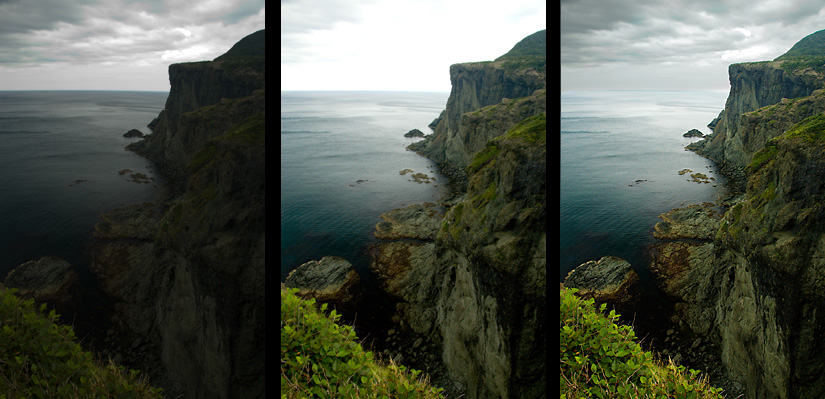
I've been looking forward to doing this tutorial since I started the blog. We will be covering Curves - including adjusting brightness and contrast with simple and complex curves, and adjusting colour balance using curves. Curves is a very powerful tool and is a big part of what (I believe) Photoshop and post processing is all about. There's much to cover, so let's begin.
Background Information
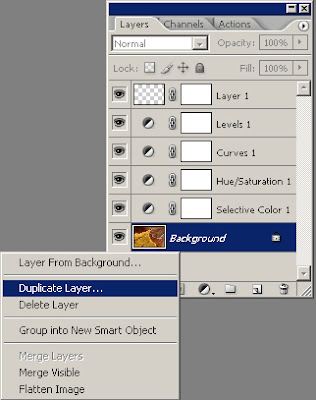
Let's cover a little history first. In a previous post, I talked about what my most common Adjustment Layers were, and how to quickly add them with Batch Processing. I will quickly cover adding a Curves adjustment layer here, but it would be a good refresher to go over those tutorials quickly.
I'd like to go over four quick point that I think will make using curves easier for you.
Pressing Alt + Left-Click in the curves window will switch back and forth between a small and a large grid. I prefer a small grid as it allows for more visual accuracy.
Clicking the icon in the bottom right-hand corner of the window will alternate between a big and small window. Again, I prefer a bigger window for better accuracy, so long as I don't need the screen space.
If you have added a point on the curve that you want to get rid of, simply click on it and drag it into an adjoining point - either the white-point or black-point on the curve, or another point you've already created.
If you have created a complicated curve that you want to reset, the easiest way to do so is hold down Alt and Left-Click on the Cancel button. Note that Cancel becomes Reset with the Alt button pressed.
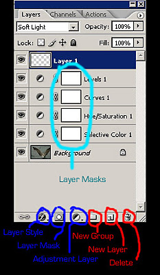
We will start in Photoshop CS2. First open an image you want to adjust the brightness and/or contrast of. Now, you can either run an action to apply your adjustment layers, or you can click on Window > Layers, then click the New Adjustment Layer icon in the bottom of that window (half black - half white circle) and select Curves. For now, click OK on the layers window, because we are going to change the blending mode of the curve.
In the drop-down menu under the Layers tab (where it currently says 'Normal'), select Luminosity from the list. This will help prevent posterization from occurring between colour and tone transitions.
One last thing to do before we begin - the histogram. This is a chart that tells us how much information is in the black point and shadows (left part of chart), the midtones (middle of chart), and highlights and white point (right of chart). To bring up the histogram, click Windows > Histogram. Then in the drop-down menu histogram window, choose Luminosity as this will show your actual brightness values. RGB simply shows the combined values of the Red, Green, and Blue levels and is not an accurate guide to the brightness values of your image. Note that this window will stay open until you close it - though you will often need to change the mode back to Luminosity.
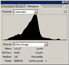
Not every histogram will look like the one above - it will change depending on the brightness values of your image, and will change as you make adjustments to your image.
When changing the brightness or contrast of the image, try to make sure no part of the histogram gets all the way to the left or the right - if it does, that means you have lost information to completely black shadows (left), or blown out hightlights (right).
Altering the Curve
Now, on to the editing of the image!
Back in your Layer window (Windows > Layers), double click on the half-black, half-white circle next to the Curves Layer. That will bring the Curves window back up.
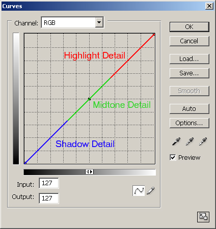
I have highlighted the major points of the curve above. The leftmost point on the curve is the black-point (where detail in the image has no lightness whatsoever); the lower portion of the curve is the shadow detail; the middle portion is the mid tones; the top portion is the highlights; and the rightmost point is the white-point (where detail in the image is completely white, with no other detail). Clicking and dragging different parts of the curve will affect the brightness values that correspond to that part of the curve. Be aware that moving one part of the curve can change values throughout the curve - just like moving a point on a taut piece of string will affect other points on that string - though to a lesser degree.
You can see in the bottom of the curves window Input and Output values. These are brightness values.
0 is no brightness, or complete black.
255 is the highest value, or completely white.
When you click a point on the curve, the Input value is what the brightness was before you made any adjustments. Logically, the Output value is the brightness after the adjustments are made.
The idea behind adjusting brightness with curves is fairly straightforward:
To make a given brightness value brighter, click on that part of the curve and drag it upwards (increase the value).
To make a given brightness value darker, click on that part of the curve and drag it downwards (decrease the value).
Before we start to edit an image, I want to cover one more thing. Contrast. The slope of the curve changes the contrast. With just a bit of logic applied, it makes sense.
The steeper any given part of the curve is, the more contrast it has. That is because you are increasing the bright values and decreasing the dark values - thus making a bigger difference between the two.
The flatter any given part of the curve is, the less contrast it has. That is because you are decreasing the bright values and increasing the dark values - thus decreasing the difference between the two.
Adding Contrast
Now, here is a fairly straightforward image that I want to add contrast to.
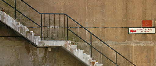
Just by looking at the image, you can see that the brightness values are fairly neutral - nothing particularly close to white, nothing particularly close to black. To be sure, though, there is a way to check.
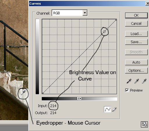
With the Curves layer window open, move the mouse cursor over the image. It will turn into an eyedropper automatically. Now, as you click and drag the mouse over the image, you will see or dot or circle move up and down the curve in the curves window. Wherever the dot is on the curve is the brightness value of that part of the image. If you want to brighten or darken a part of an image, this will tell you where to raise or lower the curve, respectively.
You can also increase the contrast of a certain tonal range by finding the brightest and darkest values in an area (click and drag the mouse around that part of the image - take note of the darkest point on the curve, as well as the brightest point).
To add contrast to the area, raise a point on the curve just to the right of the brightest point in that area, and lower a point on the curve just to the left of the darkest point in that area.
Conversely, to decrease the contrast in the areas, lower a point on the curve just to the right of the brightest point in that area, and raise a point on the curve just to the left of the darkest point in that area.
In the image of the stairs above, the brightest value in the image had a value between 215 and 220 (just over a cm (~1/2 inch) from the rightmost point on the curve), and the darkest value was between 30 and 35.
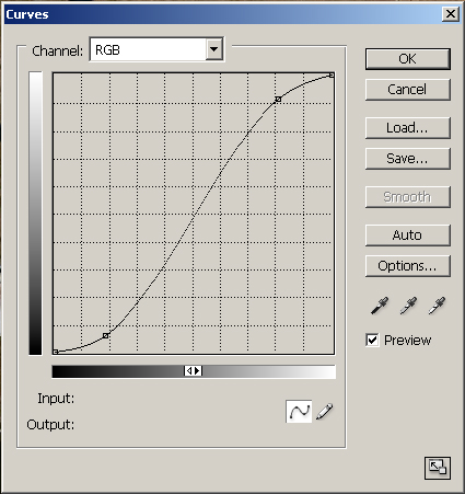
So to increase the contrast in this image, I created an S-Curve. This increased the highlight values, and decreased the shadow values, into a curve that looks like this:
The final image looks like this:
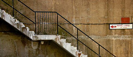
Shot with a Nikon D70s and Nikkor 18-200mm VR, 1/180s, f/6.7
You can see how the contrast was increased. Bright values became brighter, and dark values became darker. You can vary the effect by increasing or decreasing the points on the curve.
More Complex Curves
The above example was altered using a very simple curve, but not all images will be that easy to adjust (and to be honest, even that image could use some finer adjusting, but I feel it illustrated the power of simple S-Curves well). Some images may need curves that have several adjustment points. Take the following before-and-after example:
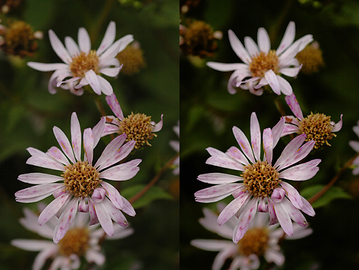
In that image I wanted to:
Add a little more contrast and brightness to the highlights (the flower petals).
Leave the contrast and brightness of the midtones (center of flowers) alone.
Darken and increase the contrast of the shadows (background).
Of course, backgrounds may not always be the darkest part of the image, and highlights may not always be the focal point, but they were in this situation.
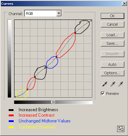
In the above screenshot you can see the curve I applied to the image to help separate the flowers from their background.
The Black areas have increased the brightness values in those parts of the image - the points on the curve are higher (and thus are brighter) that on the standard linear curve.
The Red areas have increased contrast in those parts of the image. Remember that the steeper the curve, the higher the contrast. Brighter brights + darker darks = increased contrast.
The Blue area has the same brightness and contrast values that the original image had. All the points along that part of the curve are where they were in the original linear curve.
The Yellow area is darker than the original image (and, though darker, has less contrast because the curve is flatter - though it is hardly noticeable in this image) because the values on that part of the curve are lower than they were on the original linear curve.
This is just one of the infinite number of curves you can apply to images. There are a few more things you can do with curves once you've gone beyond the basics:
Add multiple layers to the one image. Sometimes this is easier than adding one very complicated curve. Note: watch out for posterization, or overdoing the brightness and contrast values. Check the image at 100% before you are finished.
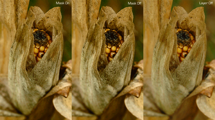
Use Layer Masks on one layer, or multiple layers, to get the desired effect.
If there is a curve you want to apply to multiple images, you can copy that Curves Adjustment Layer from one image to another by pressing Alt + Left-Click and then dragging that layer to the other images. Or, you can create an Action to apply the adjustment to several images.
You can decrease the strength of your curves layer by decreasing the Opacity in the Layers window.
Adjusting Colour Balance with Curves
Finally, one of the amazing things curves can do is adjust the colour balance. With curves alone, you can make this adjustment:
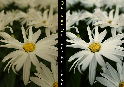
To do this, create a Curves Adjustment Layer as per normal. In the Layers Window, (Window > Layers), select New Adjustment Layer > Curves. My preference is to select OK at this point, and rename the layer so I know it is for Colour Balance. Right-click on the layer, select Layer Properties, and change the name of the layer to 'Colour Balance'.
Note: Make sure you change the blending mode to Colour so your changes won't affect the the brightness or contrast of the colours.
Before you go back into the curves Colour Balance layer, you need to bring up the Info window. Click Window > Info. Now, when you move your mouse over the image, it will show you the per-pixel value for each of the Red, Green, and Blue channels. Try to put the mouse over a part of the image that should be a neutral colour (greys or whites). In the Info window, neutral values should have equal amounts in each channel.
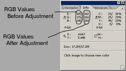
If, as in the example above, the "before" values have high levels of red, and low levels of blue, then we know we need to decrease the red, and increase the blue. Simple!
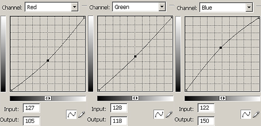
Now, go back into the Curves layer (double-click on it) and, from the drop-down menu, select Red first.
If it is the highlights that need adjusting, change the values in that part of the curve (right-most area).
If it is the shadows that need adjusting, change the values in that part of the curve (left-most area).
If the entire image needs adjusting, I generally begin by adjusting the values in the middle of the curve. If further tweaking of the highlight or shadow areas is needed, I will add those adjustments.
This part of adjusting is largely a matter of alter-check-repeat. In this case, I would decrease the red values slightly, put my mouse back over the neutral part of the image, see if the red was closer to the norm, and test again. The "changed" values are shown after the "native" values, with a slash in between them.
The necessary adjustments would be made to the green and blue channel, if necessary. All channels can be adjusted with the one Curves layer - simply select the channel you need to alter from the drop-down menu, make the changes, then select the next channel you need to alter, and so on. Here are the screenshots of the altered curves for each channel (R, G & B) for the above image:
And this is the final image after the adjustments:

Shot with a Nikon D70s and Sigma 20mm f/1.8, 1/1250s, f/4
Addendum - White Balance with Eyedropper
I just posted a link to this tutorial on the DPReview forums, and Andrew from the UK posted some advice for me on achieving more accurate white balance using curves.
Andrew pointed out that the petals in my above Daisy photo still had a slight yellow cast, and were still underexposed. He suggested (and I feel he is absolutely correct in this) the following (and I added some small details along the way):
Create a new Curves Adjustment Layer; rename 'Colour Balance'; Blend Mode: Normal.
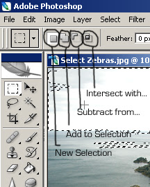
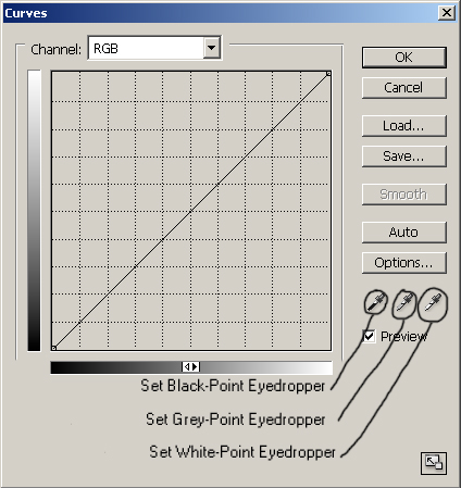
Select either the Black-point, Grey-point or White-point eyedropper from the Curves window (see image below).
Click on a part of the image that corresponds with the eyedropper chosen (in the case of the daisy photo, I used the White-point eyedropper and clicked on the brightest part of the petals).
If you do not quite have a white-point of black-point in your image, you can double-click on the corresponding eyedropper and choose the appropriate shade of grey from the colour pallet.
Tada! That's it! You've set an accurate White-point, thus correcting the colour balance, and you've corrected the exposure (assuming the point you clicked on was actually supposed to be white).
If you don't get the exact point correct with your first click, keep clicking around until you get the correct shade. Also, if the White-point you selected poorly affects the brightness and contrast of your image, you can still adjust the RGB (not individual channels) curve in the same window.
I do still feel the first lesson taught in this colour balance section is valid, as it can be used for fine tuning, and also helpful when pure whites, greys, or blacks are not in the image. But Andrew's method is clearly far more powerful.
So, thank you very much Andrew. You've been a big help. Now, let's see what his assistance did to the daisy image!

Again, thanks for the help Andrew!
Again, thanks for the help Andrew!
We covered a lot in this tutorial. From standard S-Curves for adjusting brightness and contrast, to applying more Complex Curves to images that require them. Last, and certainly not least, we covered how to adjust Colour Balance using curves.
I will cover other colour-balance techniques in a future tutorial.
I do hope this tutorial was helpful. As always, please Email me with any questions, comments, corrections, or suggestions.
Thank you.
Matt