Showing posts with label Photoshop CS2. Show all posts

Thursday, January 18, 2007

Black and White Conversions

Hello.

Today we are going to cover black and white (B&W) conversions. Converting images to B&W is a powerful tool, and there are many different ways to do it, each with a different look. These processes are for Photoshop CS2.

There are endless options, but I will cover four major, flexible conversions in this tutorial. They are the Channel Mixer, LAB Conversion, and the Greg Gorman and Daniel Diaz b&w conversion methods.

After going through these steps, it would be a good idea to review my tutorial on Actions, as it will make your life easier to automate these conversions.

I will mention this again, but it's important to note that there is no one right conversion. I often try several different conversions on the one image, as it is not always clear what the image will look like until each is applied. And you can combine two different conversions into one, using Layer Masks. For now, let's focus on the conversions themselves.

One final note - I would recommend doing most of your editing on the image before converting it to black and white - cropping, curves, cloning, removing distortion, etc.

Channel Mixer
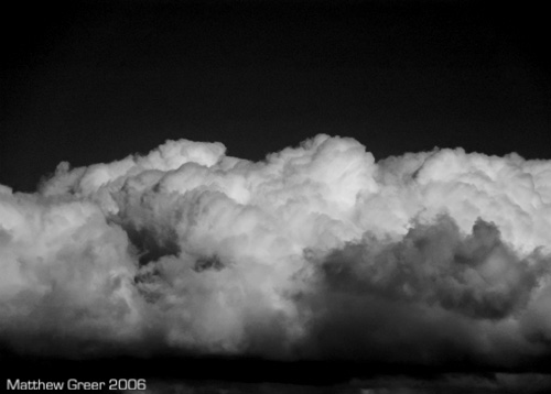


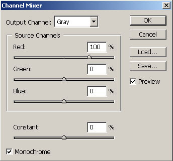
Using the Channel Mixer is probably the easiest way to do b&w conversions, and it's flexible, too. When trying different b&w methods on an image, I usually turn to this one first. You can easily see what its effect will be simply by looking in the Channels window (Window > Channels).


By clicking on the Red, Green and Blue (Ctrl+1, Ctrl+2, and Ctrl+3, respectively) channels, you can see the effect each has on the image. It is the same as using a Red, Green or Blue filter on the front of a camera when shooting b&w.

Each channel blocks its own light, and accentuates its opposite. For example, a red filter will make red objects look white, and blue objects look black - excellent for making blue skies (or cloudy skies with patches of blue) really dark and contrasty.

So, we've looked at each channel in the Channels window. Here's how to add the channel mixer to your image. (First, make sure you select the RGB (Ctrl+~) channel, so you'll see the effect on the actual image.)

  • Open the Layers window (Window > Layers).

  • In the bottom of the Layers window, click the Add New Adjustment Layer icon (half-black/half-white circle), and select Channel Mixer.

  • In the bottom-left corner of the window, click on the 'Monochrome' tick-box.

  • Adjust the Red, Green, and Blue sliders to taste - try to keep the total at approximately 100%. If you preferred the blue channel from the Channels window, put the Blue slider at 100%, and the other two at 0%. Of course, any combination of the three is fine.

    I prefer to lighten and darken the image by increasing or decreasing the Red, Green, and Blue sliders, (or with Curves after the fact) but you can adjust the Constant slider if desired.

  • Click 'OK'.


  • That's it!

    Now, you can take this one step further - you can combine two channel mixers on the one image. This is useful if you want to have the effect of one channel on part of the image, and the effect of another channel on a different part of the image.

    To do this, simply create two (or more) Channel Mixer layers, and adjust each the way you want it (I would recommend renaming each layer (by double-clicking on it) to either the part of the image it corresponds to, or to the channel is uses). Then Mask the part of each Channel Mixer layer you don't want to apply.

    Note: Using masks with channel mixers may result in overlapping layers where colour shows through.


    To avoid colour showing through, I would recommend (only after applying the channel mixers and then flattening the image) converting the image to greyscale (Image > Mode > Greyscale), then back to your colour space (eg: Image > Mode > RGB).

    LAB Conversion
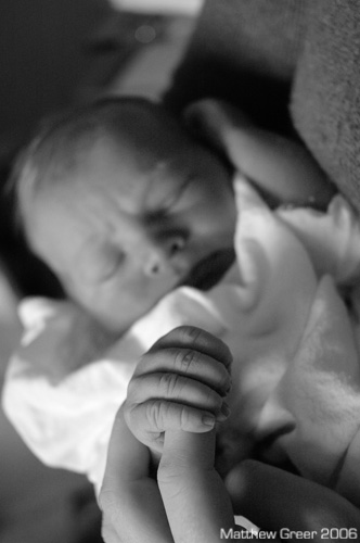


    LAB b&w conversions result in lower-contrast images with smooth tonal transitions - I find them excellent for portraits in soft, even lighting (such as studio photographs, portraits shot on cloudy days, and daylight images with fill-flash). You may find many other uses for this conversion, but I usually turn to this one first for my portraits.

    There aren't many steps in this, but you may find it easier to create an Action for this process.

    Let's go through the steps. With an image open:

  • Convert Mode to LAB (Image > Mode > LAB Colour).

  • Go to the Channels window (Window > Channels).

  • Delete the 'a' channel (right-click and 'Delete Channel', or drag layer to garbage can in bottom-right corner of window).

  • Now delete the 'Alpha 2' channel.

  • Convert Mode to Greyscale (Image > Mode > Greyscale).
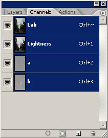


  • You're done! Now, if you want to adjust brightness or contrast, I would recommend using Curves.

    Greg Gorman Conversion
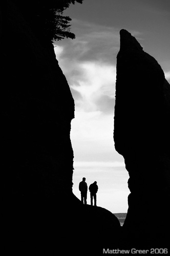


    This action was developed by Greg Gorman. You can find step-by-step of how to create the action on his website (look under 'Learn', then 'Download the B&W Conversion Tutorial') as a PDF. There are many steps, so I find it easier to just provide you with the action to download. ATNCentral hosts this action, and many more. (They are worth checking out.) I cover how to create, load, and save actions in my Actions tutorial.

    Here's the link for the action: GormanBW.atn

    This part of the tutorial will cover how to adjust the final look of the image once the action has been applied.

    I find this b&w conversion makes fairly deep, dark, black and white images. I quite like the result. The action leaves the image unflattened, and you have a number of layers you can adjust to change the final look of the image. Let's review those now.

    To make adjustment, please go the Layers window (Window > Layers).
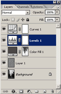


    Curves - The curves layer can be adjusted in same way as covered in my Curves tutorial. Quickly though, the left part of the curve corresponds to the darker parts of the image, and the right part to the brighter parts. Moving points on the curve upwards lightens that part of the image; lower points darkens the image. This is a good way to bring up shadows and to add controlled contrast to specific parts of the image.

    Levels - I am yet to do a Levels tutorial (it's on my to-do list). Levels is essentially a brute-force contrast adjuster with some flexibility. Moving the left-most (shadows) slider to the right increases the black-point (where the shadows become pure black). Moving the right-most (highlights) slider to the left decreases the white-point (where the highlights become pure white). The middle slider affects brightness - left = brighter, right = darker (counter-intuitive to me).

    The sliders can also be used to show you the white-point and black-point. Simply hold the Alt key while sliding the black-point or white-point sliders. You will see in the image where pixels become pure black or pure white. Handy to make sure you don't lose detail at either end.

    Colour Fill - This tool will allow you to essentially make the image darker or lighter with a grey filter. Double-clicking this tool will bring up a 'Colour Picker' window (see below). Moving the middle (greys) slider up and down will make your overall image lighter or darker, respectively.

    Layer 1 - This layer has a High Pass filter applied. High Pass is essentially a sharpening layer that also has some effect on contrast (which, actually, all sharpening does). The opacity of this layer is set to 20%. You can adjust this by changing the opacity slider in the top-right corner of the Layers window. Increasing opacity makes it sharper and more contrasty, decreasing opacity reduced sharpness and contrast.

    Background - The background layer already has some changes made to it (converted to b&w with a LAB conversion). Adjustments can be made to it, if need be, but at this stage, hopefully the bulk of your other adjustments have been done.
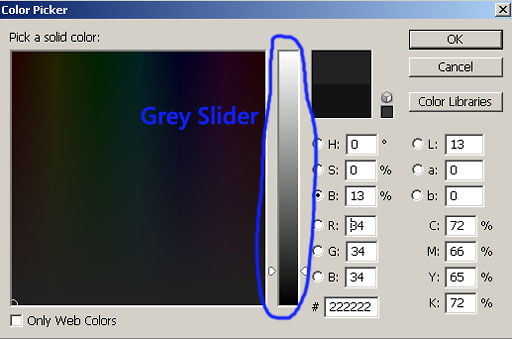
    Colour Fill adjustment - Grey Slider


    That's it! If you want to save it as a jpg, click Layer > Flatten Image.


    Daniel Diaz Conversion
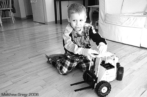


    This conversion was developed by Daniel Diaz. With his help (thanks again, Daniel!), I was able to make an action for his conversion that leaves the image with all the adjustment layers intact.

    This is a process I just recently discovered. It outputs a contrasty, sharp image. I find it great for images where there is hard flash used as it helps bring down strong highlights. It has a very pleasing tone.

    I will walk through his conversion step-by-step in a way that will output an image with no adjustment layers. However, if you want a pre-made action that outputs a file with adjustment layers that allow to make changes after the fact, you can download it here:

    Download Daniel Diaz B&W conversion.

    Now, let's go through the (many) steps involved with making this conversion.

    With the image open in Photoshop:

  • Open Channel Mixer (Image > Adjustments > Channel Mixer). Check the 'Monochrome' box in the bottom-left. Adjust the sliders to taste as we did above. Press 'OK'.

  • Open Selective Colour (Image > Adjustments > Selective Colour). From the drop-down menu, first select 'white', then adjust the black slider to taste (more black darkens whites, less lightens). Repeat with 'neutral' and 'black' from the drop-down menu. Press 'OK'.

  • Duplicate the background layer in the Layers window (Window > Layers). Right-click on the background layer and click duplicate layer. You may want to rename it 'High Pass'.

  • Run a High Pass filter (Filter > Other > High Pass). Adjust to taste. This will take some fiddling, as you won't see the final result for a couple more steps. Press 'OK'.

  • In the Layers window, change the Mode to 'Hard Light', then reduce the opacity to taste (I usually use the 35-50% range, but that's just me).

  • Flatten the image (Layer > Flatten Image).

  • Add an unusual form of sharpening. It is found in Filter > Other > Custom. There will be a grid of numbers there - just press 'OK'.

  • Now, to fade the sharpening, click Edit > Fade Custom, and fade it to taste. I usually put it in the 20-55% range, but again, that's just me.

  • You can now adjust the brightness and contrast with Curves (Image > Adjustments > Curves), Levels (Image > Adjustments > Levels), or Brightness/Contrast (Image > Adjustments > Brightness/Contrast).


  • The action for this (downloadable above) outputs an image with all the adjustments in layers. This way you can go back and change each adjustment. I prefer using the action, but the above steps allow for quick, easy conversions.

    There we have what I find to be the best b&w conversions. There are several more out there, but these are flexible, wide-ranging options that go beyond the simple Image > Mode > Greyscale conversions.

    If you have any suggestions, comments, or corrections, please Email me. Also, if either of the two links above for downloading actions don't work, let me know and I will do my best to find alternatives. Or, I could email the actions to you directly.

    Thanks!
    Matt

    Friday, December 22, 2006

    Correcting Image Distortion

    Hello.

    In today's tutorial, we will cover how to correct image distorion. Photoshop CS2 has some excellent, powerful tools to help with these problems, and I will cover them in detail. We will learn how to straighten the horizon, correct Pincushion and Barrel distortion, a couple of ways to modify perspective (correcting the illusion of buildings leaning back from shooting up at them), and finally, removing Vignetting.

    These tools, once learned, are quite easy to use. While they aren't as prominently featured in Photoshop as other features like Levels, Contrast, and Saturation, they can be just as essential in creating amazing images. Let's begin!

    Straightening the Horizon


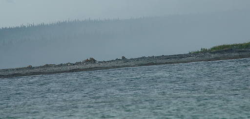
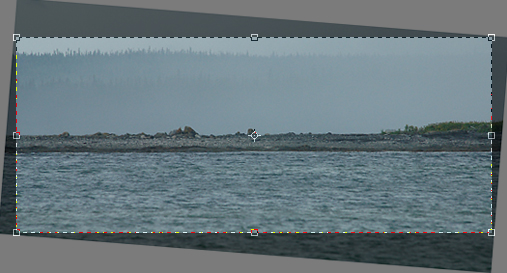
    The horizon in this shot is obviously not level. The best solution to this would be to reshoot the image, this time with the horizon straight (some tripods come with levels; you can get bubble levels that fit on the hotshoe of cameras; and many Nikon cameras have on-demand grid lines in the viewfinder that help with achieving a level horizon).

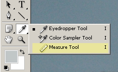
    Short of that, however, there's an easy fix in Photoshop. With the image open, select the Measure Tool from the Tools Pallet (Window > Tools), shown below. It is hidden under the eyedropper tool. You can also access the Measure Tool by pressing Shift + I repeatedly, cycling through the tools under that keyboard shortcut until the Measure tool is selected.


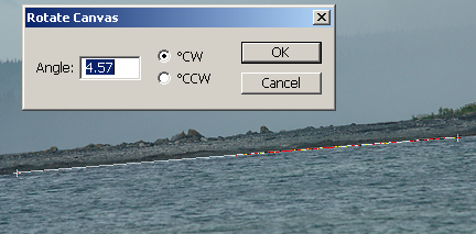
    Now, with the Measure Tool selected, click one point on the horizon, then drag the line across to another point on the horizon - a line that should normally be perfectly horizontal.
  • For fine tuning, you may find it easier to zoom in on the image (Ctrl + Space + Left-Click - zooming out is Alt + Space + Left-Click).

  • If you made a mistake with your line, simply click Clear in the Options window at the top of the screen.

  • Now that the line is drawn, click Image > Rotate Canvas > Arbitrary, and the correct value for straightening the horizon will already be calculated. Simply click OK, and the image will be rotated.


    Now, you will notice that the corners of your image need to be cropped off because of the empty white spaces left by from the rotating. Simply select the crop tool (C), select the area you want to keep, and either press Enter or click the check-mark in the Options window.


    As you can see, you lose a considerable amount of your image by doing this, which is why it is important to always pay attention to your horizon while you're shooting. Still, it is better to lose a little bit of your image than to not be able to use the image at all because it is crooked.

    Correcting Pincushion and Barrel Distortion


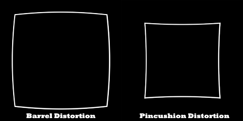
    Many lenses today have some level of distortion (see Photozone's lens reviews for more information), especially super-zooms. Much of the time, the distortion isn't noticeable. When you really see distortion is when there is a straight line running near one of the edges and it is bowing inward (pincushion) or outward (barrel). Much like using the Measure Tool mentioned above, correcting this type of distortion is usually fairly simple.

    Note: if you have multiple Layers, be sure you have either flattened the image, or have the image layer selected. This tool does not alter the entire canvas - just the selected layer.


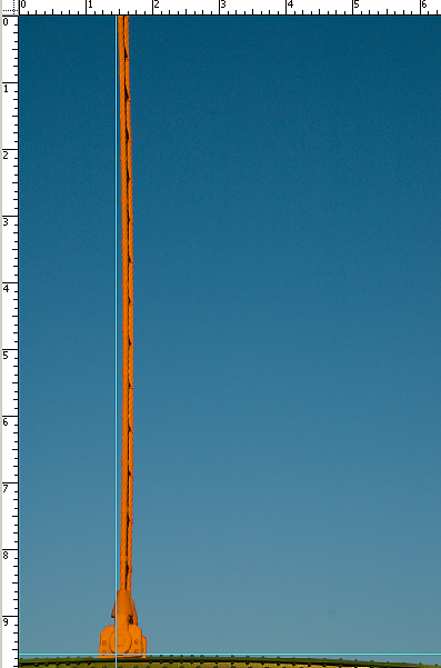
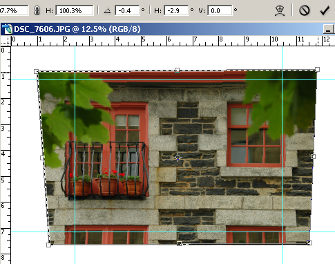
    As you can see, the above image has some obvious pincushion distortion. (The blue lines were added as guides with the ruler tool (Ctrl + R) for reference.)

    While this sort of distortion is fairly obtrusive, it is quite easy to fix. While in Photoshop, click Filter > Distort > Lens Correction and you will see the following window.


    There are a few points to make note of in this window:
  • Make sure the Remove Distortion Tool (D while in this window) is selected from the upper left-hand corner of the window.

  • If you need to move the grid around, click the hand just below (or press M), then go back to the Remove Distortion Tool.

  • Change the grid size with the Grid Size slider on the bottom of the window.

  • Clicking the Preview button on and off helps give you an idea of the changes being made to the image

  • To actually remove the distortion:
  • Slide the Remove Distortion slider (top-right of window) Left to remove Barrel Distortion.

  • Slide the Remove Distortion slider Right to remove Pincushion Distortion.

  • If you are removing Barrel Distortion (and thus pulling the sides of the image inward), then you will have blank areas around the border of your image. You will then need to crop (C) those parts of the image off. Some corner information will thus be lost, but, depending on the image, better to lose the corners than the whole image because of unacceptable distortion.

    Remember the above Lens Correction window, as we will use it again in this tutorial, for Removing Vignetting.

    Modifying Perspective


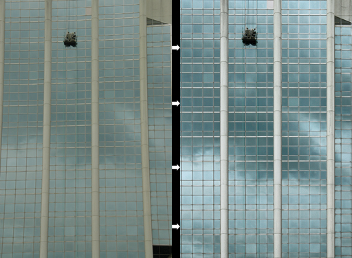
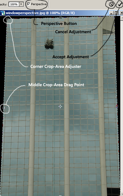
    As you can see in the first image above, the building looked to be leaning away from you. This kind of distortion is known as Perspective. The second image has it corrected (along with a Curves adjustment). This adjustment is done quite easily with the Crop tool (C).
  • With the Crop tool (C) selected, select the entire area of the image.

  • Click the Perspective button in the Options window, at the top of the screen.

  • With the image selected, click and drag the top-left crop-area corner so the left vertical line is parallel with a left line of the building. If you need to move the entire line in to make sure it lines up perfectly, do so with the middle crop-area drag point (half way between top and bottom of selection), make the adjustment, then drag the line back out.

  • Do the same adjustment with the right side.

  • Make sure the top and bottom crop-area lines line up the way they should. If you were not shooting the building (or whatever) straight on, then adjusting (lining up) these lines, can correct that perspective too, if you want it to. Just be conscious of the positions of these lines.

  • When finished lining everything up, click the check-mark (Accept Adjustment) button in the Options windows.


  • If the results aren't perfect, simply undo your actions (Ctrl + Z) and attempt it again.

    Alternate Perspective Modification Method


    Before we leave Perspective Modification, there is another way to do it. I prefer the above because it is quick and easy, and leaves you with an image ready for editing. Quickly, though, here's another way to do it.

  • Open the image that needs the perspective corrected on it

  • Make the canvas larger (Image > Canvas Size or Alt+Ctrl+C) by 30% in each direction (130% total, after choosing 'Percent' from the drop down menu), or more if radical changes are needed.

  • Add the ruler bar (Ctrl+R), and add a couple of horizontal and vertical reference lines by left-clicking in the ruler area around the edge of the image, and dragging in the reference lines.

  • With the rectangular marquee tool (M), select the image only.

  • Click Edit > Transform > Skew.

  • Now, just as with adjusting the corner control points with the crop tool, move these control points around the line up the vertical and horizontal lines in the image with the ruler reference lines. With this form of adjusting perspective, the image with adjust as you move the control points.

  • You can only adjust either the horizontal or vertical at a given time with this tool - to change the other, simply release the left mouse button and reclick to drag and adjust.

  • When completed, click on the check-mark (Accept Image Adjustments) button in the Options bar at the top of the screen.


  • You will now be left with a large, empty border around your image which you will need to crop (C) off.

    Now, finally, to vignetting!

    Correcting Vignetting


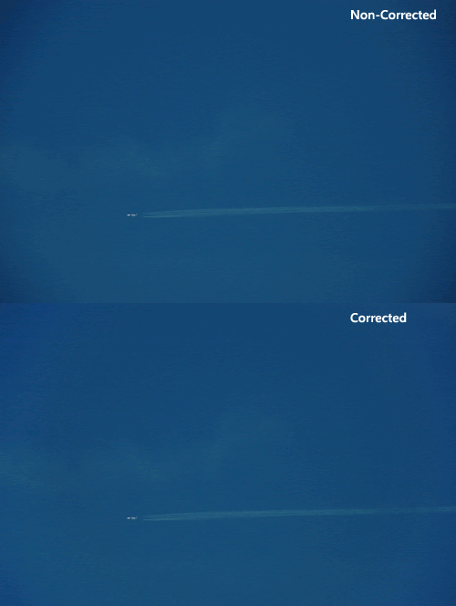
    Vignetting (sometimes called light fall-off) is the darkened corners of images. So long as the vignetting is simply light fall-off caused by the mechanical properties of the lens (and not something actually blocking the light, such as too many filters or a misaligned lens hood, which could cause complete loss of detail in the corners), the image can be easily corrected. One easy way is with the Lens Correction tool used in the Pincushion and Barrel distortion correction section.


    You can see the before and after results of removing vignetting above. The steps are quick and easy:
  • With the image open in Photoshop, click Filter > Distort > Lens Correction.

  • First, turn off the grid lines (check-box at the bottom of the window).

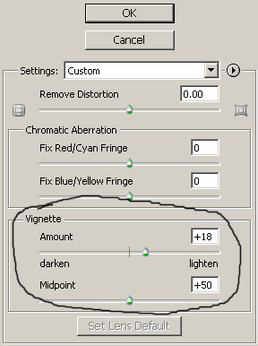
  • Note the two vignette sliders (Amount & Midpoint) on the right-hand side of the window. Slide the Amount slider to the right to lighten the corners.

  • I find for most images, keeping the Midpoint in the middle (at +50) works best.

  • At this stage, lightening is done by eyeballing. Be careful not to overdo it, as it will result in obviously light corners.

  • Click the preview button (bottom of the window) on and off as you go to see the results.


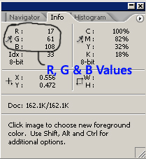
  • As a final check, you can check your brightness values with the Info window (F8). Assuming your image is supposed to have the same tonal values from the centre to the corners (you probably wouldn't notice vignetting otherwise), move the mouse over the image from center towards the corrected corners. The R, G & B values in the Info window should not increase as you approach the corners.


    Note:I usually try to leave the corners still slightly darker - this makes sure I don't over do it, and it keeps the viewer's eyes from leaving the image.


    Alternate Vignetting Removal Method


    There is one other way to remove Vignetting, though it is less precise. I sometimes remove (or add, if need be) vignetting with a Soft Light Layer. Here's how to do it:
  • With the image open in Photoshop, open the Layers window (F7) and click the Create New Layer button in the bottom of the window (or press Shift+Ctrl+N).

  • In the drop-down menu in the Layers window (the Blend mode), select Soft Light.

  • Select the Brush tool (B), change the paint colour to white (D gives the default brush colours, X alternates between the Foreground and Background colour).

  • Make the brush large ([ makes the brush smaller, ] makes the brush larger), at least 1000px, and soften the edge (Shift+[ makes it softer, Shift+] makes it harder).

  • Turn down the opacity to 10-15% (pressing 1 will make it 10%, pressing 1+5 makes it 15% - you can figure out the rest), and paint the corners of the image lighter.

  • And that's it. You've just removed most of the common distortions from your image!

    If you have any questions, comments, or suggestions about this tutorial, please Email me.

    I'll be back with more soon.

    Thanks.
    Matt

    Tuesday, December 19, 2006

    Photoshop Adjustment Layers - Curves

    Hi there.

    I've been looking forward to doing this tutorial since I started the blog. We will be covering Curves - including adjusting brightness and contrast with simple and complex curves, and adjusting colour balance using curves. Curves is a very powerful tool and is a big part of what (I believe) Photoshop and post processing is all about. There's much to cover, so let's begin.

    Background Information


    Let's cover a little history first. In a previous post, I talked about what my most common Adjustment Layers were, and how to quickly add them with Batch Processing. I will quickly cover adding a Curves adjustment layer here, but it would be a good refresher to go over those tutorials quickly.

    I'd like to go over four quick point that I think will make using curves easier for you.
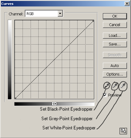
  • Pressing Alt + Left-Click in the curves window will switch back and forth between a small and a large grid. I prefer a small grid as it allows for more visual accuracy.

  • Clicking the icon in the bottom right-hand corner of the window will alternate between a big and small window. Again, I prefer a bigger window for better accuracy, so long as I don't need the screen space.

  • If you have added a point on the curve that you want to get rid of, simply click on it and drag it into an adjoining point - either the white-point or black-point on the curve, or another point you've already created.

  • If you have created a complicated curve that you want to reset, the easiest way to do so is hold down Alt and Left-Click on the Cancel button. Note that Cancel becomes Reset with the Alt button pressed.

  • We will start in Photoshop CS2. First open an image you want to adjust the brightness and/or contrast of. Now, you can either run an action to apply your adjustment layers, or you can click on Window > Layers, then click the New Adjustment Layer icon in the bottom of that window (half black - half white circle) and select Curves. For now, click OK on the layers window, because we are going to change the blending mode of the curve.

    In the drop-down menu under the Layers tab (where it currently says 'Normal'), select Luminosity from the list. This will help prevent posterization from occurring between colour and tone transitions.

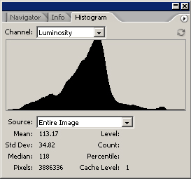
    One last thing to do before we begin - the histogram. This is a chart that tells us how much information is in the black point and shadows (left part of chart), the midtones (middle of chart), and highlights and white point (right of chart). To bring up the histogram, click Windows > Histogram. Then in the drop-down menu histogram window, choose Luminosity as this will show your actual brightness values. RGB simply shows the combined values of the Red, Green, and Blue levels and is not an accurate guide to the brightness values of your image. Note that this window will stay open until you close it - though you will often need to change the mode back to Luminosity.


    Not every histogram will look like the one above - it will change depending on the brightness values of your image, and will change as you make adjustments to your image.

    When changing the brightness or contrast of the image, try to make sure no part of the histogram gets all the way to the left or the right - if it does, that means you have lost information to completely black shadows (left), or blown out hightlights (right).

    Altering the Curve


    Now, on to the editing of the image!

    Back in your Layer window (Windows > Layers), double click on the half-black, half-white circle next to the Curves Layer. That will bring the Curves window back up.


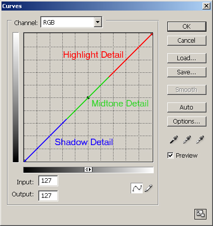
    I have highlighted the major points of the curve above. The leftmost point on the curve is the black-point (where detail in the image has no lightness whatsoever); the lower portion of the curve is the shadow detail; the middle portion is the mid tones; the top portion is the highlights; and the rightmost point is the white-point (where detail in the image is completely white, with no other detail). Clicking and dragging different parts of the curve will affect the brightness values that correspond to that part of the curve. Be aware that moving one part of the curve can change values throughout the curve - just like moving a point on a taut piece of string will affect other points on that string - though to a lesser degree.

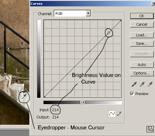
    You can see in the bottom of the curves window Input and Output values. These are brightness values.
  • 0 is no brightness, or complete black.

  • 255 is the highest value, or completely white.

  • When you click a point on the curve, the Input value is what the brightness was before you made any adjustments. Logically, the Output value is the brightness after the adjustments are made.

    The idea behind adjusting brightness with curves is fairly straightforward:
  • To make a given brightness value brighter, click on that part of the curve and drag it upwards (increase the value).

  • To make a given brightness value darker, click on that part of the curve and drag it downwards (decrease the value).

  • Before we start to edit an image, I want to cover one more thing. Contrast. The slope of the curve changes the contrast. With just a bit of logic applied, it makes sense.
  • The steeper any given part of the curve is, the more contrast it has. That is because you are increasing the bright values and decreasing the dark values - thus making a bigger difference between the two.

  • The flatter any given part of the curve is, the less contrast it has. That is because you are decreasing the bright values and increasing the dark values - thus decreasing the difference between the two.

  • Adding Contrast


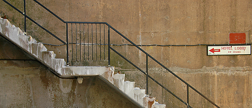
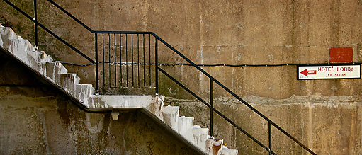
    Now, here is a fairly straightforward image that I want to add contrast to.


    Just by looking at the image, you can see that the brightness values are fairly neutral - nothing particularly close to white, nothing particularly close to black. To be sure, though, there is a way to check.

    With the Curves layer window open, move the mouse cursor over the image. It will turn into an eyedropper automatically. Now, as you click and drag the mouse over the image, you will see or dot or circle move up and down the curve in the curves window. Wherever the dot is on the curve is the brightness value of that part of the image. If you want to brighten or darken a part of an image, this will tell you where to raise or lower the curve, respectively.

    You can also increase the contrast of a certain tonal range by finding the brightest and darkest values in an area (click and drag the mouse around that part of the image - take note of the darkest point on the curve, as well as the brightest point).
  • To add contrast to the area, raise a point on the curve just to the right of the brightest point in that area, and lower a point on the curve just to the left of the darkest point in that area.

  • Conversely, to decrease the contrast in the areas, lower a point on the curve just to the right of the brightest point in that area, and raise a point on the curve just to the left of the darkest point in that area.

  • In the image of the stairs above, the brightest value in the image had a value between 215 and 220 (just over a cm (~1/2 inch) from the rightmost point on the curve), and the darkest value was between 30 and 35.


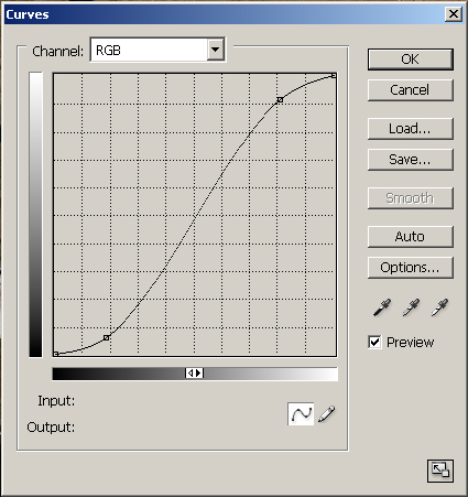
    So to increase the contrast in this image, I created an S-Curve. This increased the highlight values, and decreased the shadow values, into a curve that looks like this:


    The final image looks like this:


    Shot with a Nikon D70s and Nikkor 18-200mm VR, 1/180s, f/6.7


    You can see how the contrast was increased. Bright values became brighter, and dark values became darker. You can vary the effect by increasing or decreasing the points on the curve.

    More Complex Curves


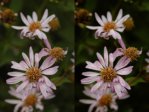
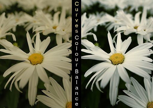
    The above example was altered using a very simple curve, but not all images will be that easy to adjust (and to be honest, even that image could use some finer adjusting, but I feel it illustrated the power of simple S-Curves well). Some images may need curves that have several adjustment points. Take the following before-and-after example:


    In that image I wanted to:
  • Add a little more contrast and brightness to the highlights (the flower petals).

  • Leave the contrast and brightness of the midtones (center of flowers) alone.

  • Darken and increase the contrast of the shadows (background).

  • Of course, backgrounds may not always be the darkest part of the image, and highlights may not always be the focal point, but they were in this situation.


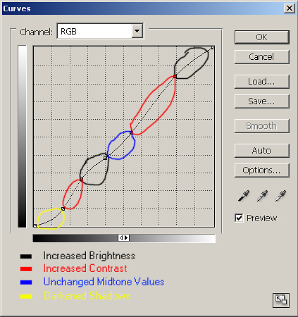
    In the above screenshot you can see the curve I applied to the image to help separate the flowers from their background.
  • The Black areas have increased the brightness values in those parts of the image - the points on the curve are higher (and thus are brighter) that on the standard linear curve.

  • The Red areas have increased contrast in those parts of the image. Remember that the steeper the curve, the higher the contrast. Brighter brights + darker darks = increased contrast.

  • The Blue area has the same brightness and contrast values that the original image had. All the points along that part of the curve are where they were in the original linear curve.

  • The Yellow area is darker than the original image (and, though darker, has less contrast because the curve is flatter - though it is hardly noticeable in this image) because the values on that part of the curve are lower than they were on the original linear curve.

  • This is just one of the infinite number of curves you can apply to images. There are a few more things you can do with curves once you've gone beyond the basics:
  • Add multiple layers to the one image. Sometimes this is easier than adding one very complicated curve. Note: watch out for posterization, or overdoing the brightness and contrast values. Check the image at 100% before you are finished.

  • Use Layer Masks on one layer, or multiple layers, to get the desired effect.

  • If there is a curve you want to apply to multiple images, you can copy that Curves Adjustment Layer from one image to another by pressing Alt + Left-Click and then dragging that layer to the other images. Or, you can create an Action to apply the adjustment to several images.

  • You can decrease the strength of your curves layer by decreasing the Opacity in the Layers window.

  • Adjusting Colour Balance with Curves


    Finally, one of the amazing things curves can do is adjust the colour balance. With curves alone, you can make this adjustment:


    To do this, create a Curves Adjustment Layer as per normal. In the Layers Window, (Window > Layers), select New Adjustment Layer > Curves. My preference is to select OK at this point, and rename the layer so I know it is for Colour Balance. Right-click on the layer, select Layer Properties, and change the name of the layer to 'Colour Balance'.

    Note: Make sure you change the blending mode to Colour so your changes won't affect the the brightness or contrast of the colours.


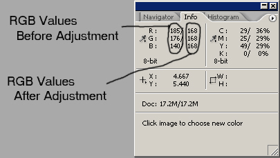
    Before you go back into the curves Colour Balance layer, you need to bring up the Info window. Click Window > Info. Now, when you move your mouse over the image, it will show you the per-pixel value for each of the Red, Green, and Blue channels. Try to put the mouse over a part of the image that should be a neutral colour (greys or whites). In the Info window, neutral values should have equal amounts in each channel.


    If, as in the example above, the "before" values have high levels of red, and low levels of blue, then we know we need to decrease the red, and increase the blue. Simple!

    Now, go back into the Curves layer (double-click on it) and, from the drop-down menu, select Red first.
  • If it is the highlights that need adjusting, change the values in that part of the curve (right-most area).

  • If it is the shadows that need adjusting, change the values in that part of the curve (left-most area).

  • If the entire image needs adjusting, I generally begin by adjusting the values in the middle of the curve. If further tweaking of the highlight or shadow areas is needed, I will add those adjustments.

  • This part of adjusting is largely a matter of alter-check-repeat. In this case, I would decrease the red values slightly, put my mouse back over the neutral part of the image, see if the red was closer to the norm, and test again. The "changed" values are shown after the "native" values, with a slash in between them.

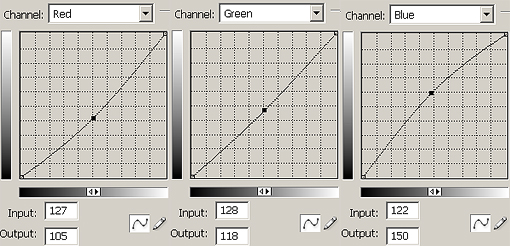
    The necessary adjustments would be made to the green and blue channel, if necessary. All channels can be adjusted with the one Curves layer - simply select the channel you need to alter from the drop-down menu, make the changes, then select the next channel you need to alter, and so on. Here are the screenshots of the altered curves for each channel (R, G & B) for the above image:


    And this is the final image after the adjustments:


    Shot with a Nikon D70s and Sigma 20mm f/1.8, 1/1250s, f/4


    Addendum - White Balance with Eyedropper


    I just posted a link to this tutorial on the DPReview forums, and Andrew from the UK posted some advice for me on achieving more accurate white balance using curves.

    Andrew pointed out that the petals in my above Daisy photo still had a slight yellow cast, and were still underexposed. He suggested (and I feel he is absolutely correct in this) the following (and I added some small details along the way):
  • Create a new Curves Adjustment Layer; rename 'Colour Balance'; Blend Mode: Normal.

  • Select either the Black-point, Grey-point or White-point eyedropper from the Curves window (see image below).

  • Click on a part of the image that corresponds with the eyedropper chosen (in the case of the daisy photo, I used the White-point eyedropper and clicked on the brightest part of the petals).

  • If you do not quite have a white-point of black-point in your image, you can double-click on the corresponding eyedropper and choose the appropriate shade of grey from the colour pallet.

  • Tada! That's it! You've set an accurate White-point, thus correcting the colour balance, and you've corrected the exposure (assuming the point you clicked on was actually supposed to be white).


  • If you don't get the exact point correct with your first click, keep clicking around until you get the correct shade. Also, if the White-point you selected poorly affects the brightness and contrast of your image, you can still adjust the RGB (not individual channels) curve in the same window.

    I do still feel the first lesson taught in this colour balance section is valid, as it can be used for fine tuning, and also helpful when pure whites, greys, or blacks are not in the image. But Andrew's method is clearly far more powerful.

    So, thank you very much Andrew. You've been a big help. Now, let's see what his assistance did to the daisy image!


    Again, thanks for the help Andrew!


    We covered a lot in this tutorial. From standard S-Curves for adjusting brightness and contrast, to applying more Complex Curves to images that require them. Last, and certainly not least, we covered how to adjust Colour Balance using curves.

    I will cover other colour-balance techniques in a future tutorial.

    I do hope this tutorial was helpful. As always, please Email me with any questions, comments, corrections, or suggestions.

    Thank you.
    Matt

    Tuesday, December 12, 2006

    Custom Photoshop Paintbrush

    Hello again.

    In this tutorial, we are going to create a custom paint brush. This technique has many uses - you can create a signature to apply to your images at any size or colour, or a particular pattern you want to be able to apply to your image. The best news - it's quick and easy to do once you know how.


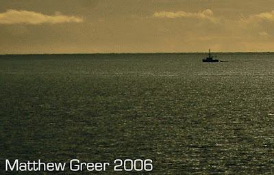
    Above is the corner crop from one of my images where I have applied a simple signature. I only had to type those letters out once, then created a paintbrush for it. Now every time I want to use that, I can make it any size I want and any colour I want. Then one click and it's applied!

    I'd like to go over one thing first. There are several Keyboard Shortcuts that assist when using the paintbrush. Follow that link to view them.

    First we are going to start with a new canvas in Photoshop (File > New > New Image or Ctrl + N). Be sure to make the background contents transparent, so the spaces in your paintbrush allow the background to show through.

    Make the new image fairly big - it's better to have a big paintbrush that you can later make smaller, than to have a small paintbrush that you have to distort to make bigger. If you are creating a signature paintbrush, I would recommend a canvas at least 1,000 pixels across, and however high you need it to be. I believe your brush will max out at 999 x 999 pixels, so there is really no need to go beyond this max. We don't need to use the entire canvas either, though, so feel free to give yourself room.

    You can now create any pattern or image on the canvas you want. You can even use part of an existing image, if you like. For me, my main use was creating a quick and easy signature brush.


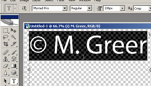
    I used the text tool, T, and with black and 100% opacity, wrote out what I wanted for my signature. Black is good to use the first time around as it is solid and clear - you can change the brush colour to anything you want once the brush itself is created.

    Note: To create the Copyright (©) symbol, press Alt + 0 + 1 + 6 + 9 on the keypad.


    Here's the step-by-step from here on in:

  • You do not want to flatten the image, as this will make the background white. Then every time you use your brush, it will have a while box around it.

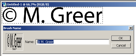
  • Now, select the area of the image you want to use as your brush with the Rectangular Marquee tool (M). Make sure you are making the selection from the layer with detail on it - view layers in the Layer Window, Window > Layers.

  • Now click Edit > Define Brush Preset and name your brush whatever you want (I prefer specific names, because sometimes the brush icon isn't clear for large brushes).


  • That's it - you're done!

    Now, to use your custom brush:
  • Select the brush tool (B).

  • Open the brush pallet (F5 or right-click on the image while using the brush tool).

  • Click on your custom brush to select it. To close the pallet, press F5 again or Esc.

  • Choose any colour you want from the colour pallet in the Tools window. You can adjust the opacity with the slider at the top of the screen, or by entering a value (pressing 1=10%, 2=20%, 3=30%, etc.).

  • You can adjust the brush size in the top toolbar as well, or by pressing [ to make it smaller, and ] to make it larger.


  • Quick. Simple. And you're no longer restricted to the brushes provided to you. I hope this has made your life a little bit easier!

    Thanks.
    Matt

    Friday, December 08, 2006

    Photoshop Keyboard Shortcuts

    Hello.

    I was beginning to write a tutorial on Layer Masks, and in the first few lines of my outline, I was wanting desperately to speak of the useful keyboard shortcuts like they were all know and old-hat to all. Well, they are hardly old-hat to me. I learn (or re-learn, as the case often is) new keyboard shortcuts daily, and find they greatly improve my image editing efficiency. So, here's a list of the major keyboard shortcuts that I use for Photoshop CS2. If there are others you feel are essential and useful for others, please email me. I'm happy to learn and share with everyone else!

    Note: I just added a short section at the end here on Custom Keyboard Shortcuts. Thanks to all the people on DPReview forums who helped with this!


    Many of the keyboard shortcuts can be found easily by putting your mouse over a tool in the Tools Window (accessed by clicking Window > Tools):

    Many shortcuts can also be seen by clicking on something in the menu bar (File, Edit, Image, Layer, etc.) then seeing the keyboard shortcut (if it exists) to the right of the command.

    Here are some shortcuts that I find very useful. Any letter or keyboard command shown in bold in this tutorial is meant as a keyboard shortcut - this will eliinmate me needing to say 'press on the keyboard....' Also, where you see shift + ... means press Shift and whichever key - not Shift key and Plus Key and named key.:

    Brush Shortcuts

    While in brush mode, B, you can switch the paint brush colours to their default (black and white) with D, and/or switch the foreground and background colours with X. This is handy if you're using two different colours; you can put one in the main pallet, X to switch, change the new main pallet colour, then switch them back and forth as you need to.

    Still with brush B (it's good to practice - makes them second nature!), you can decrease the brush size with [ and increase it with ] and - left = smaller, right = bigger.

    Similarly, you can soften the edge of the brush with Shift + [ and harden it with Shift + ].

    You can change the brush's opacity with the number pad (top or side) simply by pressing a value. This has a quick-mode built in: press 2 and it becomes 20% opacity; 9 and it becomes 90%. If you need a mid-point value, like 23%, press2 + 3 quickly. If you need a sub-10 value, press 0 first (ex: 0 + 7 gets 7%). Finally, 1 + 0 + 0 is what's needed to return to 100%.

    Also, you can change the brush flow by pressing Shift + 'value' on the top number pad with all the same rules as with with changing opacity, above.

    Finally, you can use the colour sampling tool while using the paintbrush by pressing Alt and left-clicking with the mouse. The colour sample tool disappears as soon as you release Alt.

    Common Tool Keyboard Shortcuts


    V: Move tool - moves image or active layer around canvas.

    C: Crop tool. Once an area is selected, Enter will confirm the crop.

    J: Spot Healing tool (Shift + J cycles through spot healing, healing brush, patch tool, and red eye).

    I:Eyedropper tool - colour selection.

    H: Hand - similar to 'Space' below, but does not switch off when released. If you are zoomed into an image to the point were it takes up more area than the screen size, this will allow you to move the image around without affecting its position on the canvas.

    Other Useful Keyboard Shortcuts


    Tab hides/unhides all the non-image windows - very handy if working on a large image.

    Space while using any tool will bring up the hand tool until you release the space bar - handy if you need to move a large image around the screen while doing other work.

    Ctrl + Space + Click will zoom in on the image one click at a time.

    Alt + Space + Click will zoom out on the image one click at a time.

    Alt + Backspace will fill a Layer Mask with the foreground colour (only shades of grey).

    Ctrl + Backspace will fill a Layer Mask with background colour (again, only shades of grey).

    Ctrl + Shift + S is the Save-As command - be careful not to press just Ctrl + S as that will do a regular save, and overwrite the existing image.

    Ctrl + F4 closed the active image only. This will work in most Windows programs that have windows-in-windows - it closes the active sub-window. Note that Alt + F4 closes the entire program.

    Custom Keyboard Shortcuts

    The good people at DPReview pointed out this site, which has pdf's of all the Photoshop keyboard shortcuts. Well, I was excited to see this, because I always wanted to know what the shortcut was to Flatten the adjustment layers of an image. Well, one pdf said is was Ctrl + Shift + Alt + 0, but that this was a custom command. So I did a little bit of looking and found out how to add custom keyboard shortcuts. So if there is a command you access via the Menu Bar (File, Edit, Image, Layer, etc.) that does not have a keyboard shortcut, and you want to add one, here's how you go about it.

    In Photoshop, click Edit > Keyboard Shortcuts... (or press Alt + Shift + Ctrl + K) and this window will appear:


    Find the command you want by looking under the appropriate sections. For instance, I wanted to add a keyboard shortcut for flattening layers (normally under Layer > Flatten Image), so I clicked the 'expand' triangle next to Layers then scrolled down until I found Flatten Image. Click the bar that Flatten Image is in, and it gives you a field to enter a command.


    Now, press the buttons on the keyboard exactly as you want to shortcut to work. Again, for mine, I pressed Ctrl + Shift + Alt + 0. If the one you choose is already in use, or just cannot be used, it will warn you at the bottom of the window.

    When you've applied all the shortcuts you want to for now, click Accept, then OK. And you're finished!

    I know Photoshop has hundreds of keyboard shortcuts. I find these the most common and most convenient. Like I said above, please email me if you have a suggestion for another popular one. I'd love to hear from you.

    Please enjoy. I'll be posting more soon.
    Matt