Today we are going to cover black and white (B&W) conversions. Converting images to B&W is a powerful tool, and there are many different ways to do it, each with a different look. These processes are for Photoshop CS2.
There are endless options, but I will cover four major, flexible conversions in this tutorial. They are the Channel Mixer, LAB Conversion, and the Greg Gorman and Daniel Diaz b&w conversion methods.
After going through these steps, it would be a good idea to review my tutorial on Actions, as it will make your life easier to automate these conversions.
I will mention this again, but it's important to note that there is no one right conversion. I often try several different conversions on the one image, as it is not always clear what the image will look like until each is applied. And you can combine two different conversions into one, using Layer Masks. For now, let's focus on the conversions themselves.
One final note - I would recommend doing most of your editing on the image before converting it to black and white - cropping, curves, cloning, removing distortion, etc.
Channel Mixer
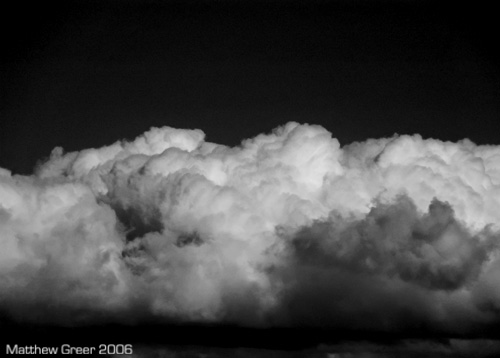
Using the Channel Mixer is probably the easiest way to do b&w conversions, and it's flexible, too. When trying different b&w methods on an image, I usually turn to this one first. You can easily see what its effect will be simply by looking in the Channels window (Window > Channels).

By clicking on the Red, Green and Blue (Ctrl+1, Ctrl+2, and Ctrl+3, respectively) channels, you can see the effect each has on the image. It is the same as using a Red, Green or Blue filter on the front of a camera when shooting b&w.
Each channel blocks its own light, and accentuates its opposite. For example, a red filter will make red objects look white, and blue objects look black - excellent for making blue skies (or cloudy skies with patches of blue) really dark and contrasty.
So, we've looked at each channel in the Channels window. Here's how to add the channel mixer to your image. (First, make sure you select the RGB (Ctrl+~) channel, so you'll see the effect on the actual image.)
Open the Layers window (Window > Layers).
In the bottom of the Layers window, click the Add New Adjustment Layer icon (half-black/half-white circle), and select Channel Mixer.
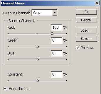
In the bottom-left corner of the window, click on the 'Monochrome' tick-box.
Adjust the Red, Green, and Blue sliders to taste - try to keep the total at approximately 100%. If you preferred the blue channel from the Channels window, put the Blue slider at 100%, and the other two at 0%. Of course, any combination of the three is fine.
I prefer to lighten and darken the image by increasing or decreasing the Red, Green, and Blue sliders, (or with Curves after the fact) but you can adjust the Constant slider if desired.
Click 'OK'.
That's it!
Now, you can take this one step further - you can combine two channel mixers on the one image. This is useful if you want to have the effect of one channel on part of the image, and the effect of another channel on a different part of the image.
To do this, simply create two (or more) Channel Mixer layers, and adjust each the way you want it (I would recommend renaming each layer (by double-clicking on it) to either the part of the image it corresponds to, or to the channel is uses). Then Mask the part of each Channel Mixer layer you don't want to apply.
Note: Using masks with channel mixers may result in overlapping layers where colour shows through.
To avoid colour showing through, I would recommend (only after applying the channel mixers and then flattening the image) converting the image to greyscale (Image > Mode > Greyscale), then back to your colour space (eg: Image > Mode > RGB).
LAB Conversion
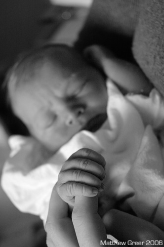
LAB b&w conversions result in lower-contrast images with smooth tonal transitions - I find them excellent for portraits in soft, even lighting (such as studio photographs, portraits shot on cloudy days, and daylight images with fill-flash). You may find many other uses for this conversion, but I usually turn to this one first for my portraits.
There aren't many steps in this, but you may find it easier to create an Action for this process.
Let's go through the steps. With an image open:
Convert Mode to LAB (Image > Mode > LAB Colour).
Go to the Channels window (Window > Channels).
Delete the 'a' channel (right-click and 'Delete Channel', or drag layer to garbage can in bottom-right corner of window).
Now delete the 'Alpha 2' channel.
Convert Mode to Greyscale (Image > Mode > Greyscale).
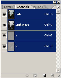
You're done! Now, if you want to adjust brightness or contrast, I would recommend using Curves.
Greg Gorman Conversion
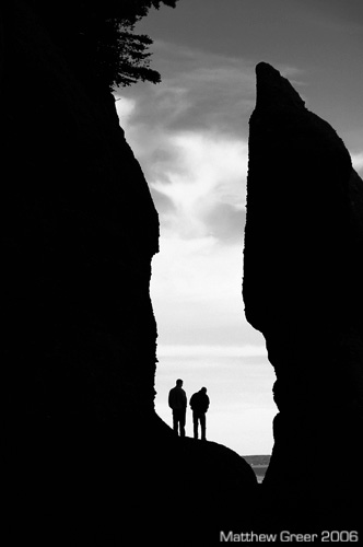
This action was developed by Greg Gorman. You can find step-by-step of how to create the action on his website (look under 'Learn', then 'Download the B&W Conversion Tutorial') as a PDF. There are many steps, so I find it easier to just provide you with the action to download. ATNCentral hosts this action, and many more. (They are worth checking out.) I cover how to create, load, and save actions in my Actions tutorial.
Here's the link for the action: GormanBW.atn
This part of the tutorial will cover how to adjust the final look of the image once the action has been applied.
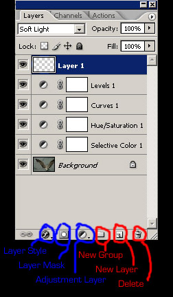
I find this b&w conversion makes fairly deep, dark, black and white images. I quite like the result. The action leaves the image unflattened, and you have a number of layers you can adjust to change the final look of the image. Let's review those now.
To make adjustment, please go the Layers window (Window > Layers).
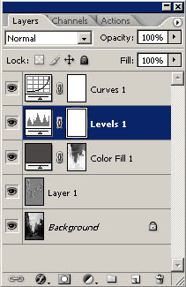
Curves - The curves layer can be adjusted in same way as covered in my Curves tutorial. Quickly though, the left part of the curve corresponds to the darker parts of the image, and the right part to the brighter parts. Moving points on the curve upwards lightens that part of the image; lower points darkens the image. This is a good way to bring up shadows and to add controlled contrast to specific parts of the image.
Levels - I am yet to do a Levels tutorial (it's on my to-do list). Levels is essentially a brute-force contrast adjuster with some flexibility. Moving the left-most (shadows) slider to the right increases the black-point (where the shadows become pure black). Moving the right-most (highlights) slider to the left decreases the white-point (where the highlights become pure white). The middle slider affects brightness - left = brighter, right = darker (counter-intuitive to me).
The sliders can also be used to show you the white-point and black-point. Simply hold the Alt key while sliding the black-point or white-point sliders. You will see in the image where pixels become pure black or pure white. Handy to make sure you don't lose detail at either end.
Colour Fill - This tool will allow you to essentially make the image darker or lighter with a grey filter. Double-clicking this tool will bring up a 'Colour Picker' window (see below). Moving the middle (greys) slider up and down will make your overall image lighter or darker, respectively.
Layer 1 - This layer has a High Pass filter applied. High Pass is essentially a sharpening layer that also has some effect on contrast (which, actually, all sharpening does). The opacity of this layer is set to 20%. You can adjust this by changing the opacity slider in the top-right corner of the Layers window. Increasing opacity makes it sharper and more contrasty, decreasing opacity reduced sharpness and contrast.
Background - The background layer already has some changes made to it (converted to b&w with a LAB conversion). Adjustments can be made to it, if need be, but at this stage, hopefully the bulk of your other adjustments have been done.
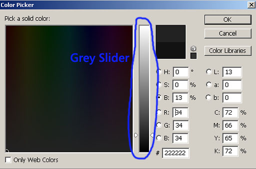
Colour Fill adjustment - Grey Slider
That's it! If you want to save it as a jpg, click Layer > Flatten Image.
Daniel Diaz Conversion
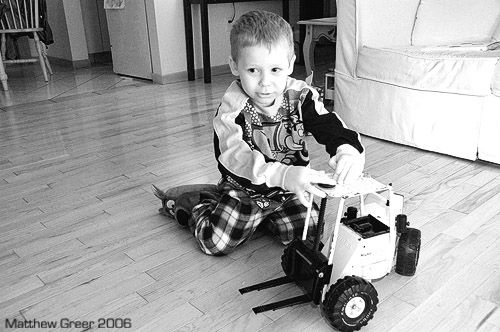
This conversion was developed by Daniel Diaz. With his help (thanks again, Daniel!), I was able to make an action for his conversion that leaves the image with all the adjustment layers intact.
This is a process I just recently discovered. It outputs a contrasty, sharp image. I find it great for images where there is hard flash used as it helps bring down strong highlights. It has a very pleasing tone.
I will walk through his conversion step-by-step in a way that will output an image with no adjustment layers. However, if you want a pre-made action that outputs a file with adjustment layers that allow to make changes after the fact, you can download it here:
Download Daniel Diaz B&W conversion.
Now, let's go through the (many) steps involved with making this conversion.
With the image open in Photoshop:
Open Channel Mixer (Image > Adjustments > Channel Mixer). Check the 'Monochrome' box in the bottom-left. Adjust the sliders to taste as we did above. Press 'OK'.
Open Selective Colour (Image > Adjustments > Selective Colour). From the drop-down menu, first select 'white', then adjust the black slider to taste (more black darkens whites, less lightens). Repeat with 'neutral' and 'black' from the drop-down menu. Press 'OK'.
Duplicate the background layer in the Layers window (Window > Layers). Right-click on the background layer and click duplicate layer. You may want to rename it 'High Pass'.
Run a High Pass filter (Filter > Other > High Pass). Adjust to taste. This will take some fiddling, as you won't see the final result for a couple more steps. Press 'OK'.
In the Layers window, change the Mode to 'Hard Light', then reduce the opacity to taste (I usually use the 35-50% range, but that's just me).
Flatten the image (Layer > Flatten Image).
Add an unusual form of sharpening. It is found in Filter > Other > Custom. There will be a grid of numbers there - just press 'OK'.
Now, to fade the sharpening, click Edit > Fade Custom, and fade it to taste. I usually put it in the 20-55% range, but again, that's just me.
You can now adjust the brightness and contrast with Curves (Image > Adjustments > Curves), Levels (Image > Adjustments > Levels), or Brightness/Contrast (Image > Adjustments > Brightness/Contrast).
The action for this (downloadable above) outputs an image with all the adjustments in layers. This way you can go back and change each adjustment. I prefer using the action, but the above steps allow for quick, easy conversions.
There we have what I find to be the best b&w conversions. There are several more out there, but these are flexible, wide-ranging options that go beyond the simple Image > Mode > Greyscale conversions.
If you have any suggestions, comments, or corrections, please Email me. Also, if either of the two links above for downloading actions don't work, let me know and I will do my best to find alternatives. Or, I could email the actions to you directly.
Thanks!
Matt